Children love colors – even if they can’t always decide which one is currently their favorite. As adults, we also associate a great deal with colors, but have a somewhat different relationship with them. In this article, you’ll learn why that is and how you can use both of these facts to your advantage – whether when choosing furniture for your home or toys for your kids.
How Do We Perceive Colors in the First Place?
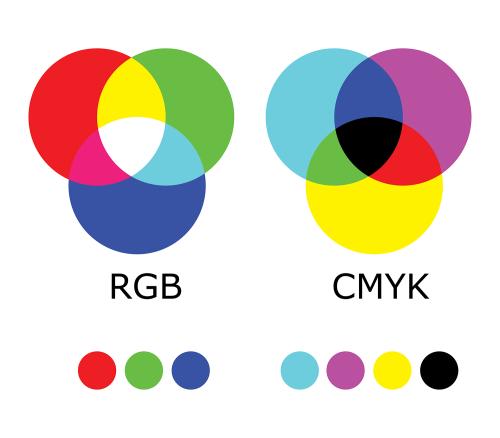
What happens when we see a blue car on the road? Is the color blue a characteristic of the vehicle? Not at all. Instead, we just perceive it as blue. The first mammals that lived on earth wouldn’t have been able to do this because they could only distinguish between long-wave and short-wave light. Since they were nocturnal, that was enough for them. In contrast, humans have three types of cones in our retinas – the first is sensitive to blue, the second to green, and the third to red. All of the colors we can see are mixed together from these three colors. That’s why when referring to screens, we almost always talk about the RGB color space – depending on how they’re mixed, these three primary colors can be used to create approximately 16 million different colors. Besides RGB, there’s also the CMYK model, which is used in the printing industry. In this case, the colors are mixed differently, using the base colors cyan, magenta, yellow, and black (represented by a K, which stands for “key”). Going back to our car example, when light hits it, only the blue color components are reflected and therefore perceived by our eyes. All of the remaining parts of the light spectrum are absorbed by the car, so we don’t see them.
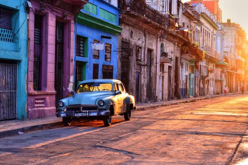
How we perceive a color also depends on the light source. If we illuminate a tomato with green light, for example, it appears black to us. So it’s really all a matter of perception. This is most obvious when we consider color blindness – how does someone who can’t see red, i.e., is missing the necessary cones, see a tomato?
Interestingly, there are also colors that aren’t actually colors at all: black, white, and gray. From a scientific point of view, these really aren’t colors, even though they are perceived as such by the human eye. That’s why they’re referred to as noncolors or achromatic colors. In the case of black, the light that hits an object is completely absorbed. For a similar reason, “all cats are gray in the dark” (even those with red fur) – in this case, once again, there’s no light source so there’s nothing that can be reflected. White objects, on the other hand, completely reflect all of the light back and therefore appear white to us.
As you surely know, animals are able to see different wavelengths of light. Bees, for example, are attracted to the flowers of the lesser celandine plant, which reflect ultraviolet light. To a bee, the center of the flower appears darker, while we perceive the entire flower as being solid yellow.
How Different Cultures Perceive Color
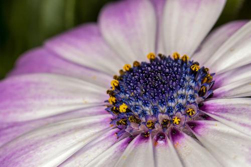
How we perceive color doesn’t only depend on the structure of our eye or the lighting – the culture we grew up in as a child also shapes us in this respect. A number of languages don’t make a linguistic distinction between green and blue, like Vietnamese, for example. On the opposite end of the spectrum, Polish has completely different words for light blue and dark blue (niebieski and granatowy, respectively). The fact that colors play an important role in all languages, however, can be seen in the many idioms containing different colors – although the colors can mean different things in each language.
For example, someone who is blau (“blue”) in the German-speaking world might want to have a little less booze next time they go out. And if they do drink less next time they are at the bar, they’d only be être gris, or gray, in France – meaning tipsy. And as we all know, in the English-speaking world, “feeling blue” doesn’t have anything to do with alcohol, although if you are feeling blue, it’s better not to drink. In German-speaking countries, calling some blauäugig (“blue-eyed”) means that they’re naive; in English-speaking countries, on the other hand, a “blue-eyed boy” refers to someone treated with special favor.
If a German doesn’t like someone, they say the person ist mir nicht grün (“isn’t green to me”). Just like Americans, Germans can be grün vor Neid (“green with envy”) when someone has something that they want. In France, on the other hand, people être vert de rage (“are green with rage”) – and not red like here. In France, people also have a “yellow laugh,” but not because of the color of their teeth. Instead, the term rire jaune is used to describe a forced laugh.
These few examples are enough to show how much meaning colors can carry and how they can shape the consciousness of a nation or a single individual. The differences stem from geographical circumstances, history, or religion. For example, white is the color of mourning in Asia. But many countries – including the United Kingdom, Germany, the United States, Australia, Malaysia, and China – have one thing in common: blue is the most popular color. This preference presumably stems from the fact that the sky and the ocean are also blue, and most people have positive associations with both.
Color Symbolism/Color Psychology
Blue
As the color of the sky and water, blue stands for depth and expansiveness. The color radiates tranquility, stability, and infinity. Symbolically, it stands for harmony, loyalty, sympathy, and honesty. In addition, it looks fresh and friendly. Blue symbolizes truth and integrity. That’s why the color is often found in corporate logos and is also the color used by many social networks. On the other hand, blue can also be perceived as indifferent and distant.

In the field of color psychology, blue has a calming and cooling effect. It harmonizes, relaxes, and defuses tension. Anxious people or people with trouble sleeping would do well to surround themselves with shades of blue.
Green
Green is mainly found in the natural world, which is why it primarily stands for nature and harmony, relaxation, tranquility, and serenity. Green is also the color of hope and life, health, and fertility. It is associated with freedom and safety. It often stands for new beginnings. On the negative side, green is associated with poison – hence the term “green around the gills” for when you aren’t feeling well.
Green is the color of balance and has a calming and relaxing effect, but conversely, also a refreshing and regenerative effect.

Red
We already begin to associate colors with certain objects during childhood. When it comes to the color red, for example, associations could include strawberries or raspberries as typical red fruits. Red stands for life, power, vitality, activity, strength, and energy. It’s the color of love and passion, but on the other hand, it’s also the color of blood. Red symbolizes punishment, struggle, and stands for things we aren’t allowed to do. It sets off our alarm bells and attracts attention.
Red has a warming and exciting – but also agitating – effect. It’s stimulating and activating but can also lead to an aggressive mood and restlessness.
Yellow
When it comes to yellow, many people first think of bananas. Or a raincoat. Yellow is the color of the sun and the brightest color in the entire color spectrum. It stands for warmth, activity and creativity, maturity, strength, success, and happiness. The color is especially popular in China. But it also has conflicting meanings and stands just as much for betrayal, greed, lies, mental illness, or is used as a warning.
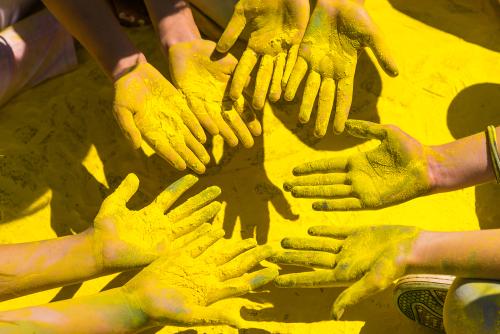
Yellow is ideal for people with depression, as it is associated with optimism, cheerfulness, friendliness, and confidence. In addition, the color also increases our ability to concentrate.
Pastels
Pastels are light shades of primary or secondary colors. They are distinguished by their particularly high white content. That’s why they’re not usually found on a painter’s regular palette. They are said to have a “dual personality” – on the one hand, they stand for all the characteristics of their base color. As such, antique pink carries all the qualities attributed to red, but at the same time, has a calming effect. Overall, pastel colors are associated with spring and summer.
Paintings by impressionist artists are known for their pastels. The artists used lighter shades instead of the darker ones that were much more common in paintings at the time. While painting, they focused on sensory perception rather than trying to tell a story in their works. They painted an object or a color for the sake of its colors, not because it was primarily about the object itself.
From the perspective of color psychology, pastels have a relaxing, soothing, and cool effect. They create a harmonious atmosphere.

How Children Perceive Color
Colors play an important role in child development, especially since children have an intuitive connection to them. Newborns feel especially comfortable when surrounded by the color red; it isn’t uncommon for a baby to be wrapped in a red blanket after being born – this has a particularly calming effect. Researchers from the Surrey Baby Lab suggest that the color reminds them of being inside their mother’s belly – where they really felt at home. Canadian researchers, in turn, found that many newborns can’t recognize the color blue. This is due to the fact that the cone responsible for perceiving the color blue is the last to develop.
Young children particularly need to be around bright colors as they help their spatial thinking develop especially well. Contrasting colors make it easier for them to comprehend space, especially since young children’s three-dimensional vision and depth perception aren’t yet well developed. That’s why it’s good to opt for toys in bright and contrasting colors, especially early on, otherwise the little ones’ brains could become overwhelmed. In contrast, children perceive bright colors with strong contrasts particularly well.
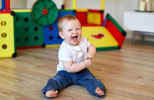
Babies can recognize all of the primary colors from three to four months of age onwards. After that, their ability to perceive more of color spectrum continues to develop over the years. Surprisingly, it isn’t until children reach their teens that they’re able to distinguish between soft pastel colors. Before that, their brain mainly classifies any bright, high-contrast color as important enough for the child to actually notice it. Scientists therefore advise presenting children colors from as much of the spectrum as possible in order to support their development in this area. Brightly colored toys are particularly suitable for this purpose.
Do Children Have a Favorite Color?
Why of course they do – often more than one. Indeed, a child’s favorite color can change according to his or her mood and depends on various factors over the course of their life, from the colors of their favorite sports team to the color of their favorite sweater or the color of the turquoise ocean where they went on vacation with their family. Children tend to like bright colors. This is how they separate themselves from the adult world which, as far as color is concerned, is determined by fashion and trends. Dr. Anna Franklin of the Surrey Baby Lab found out that babies are most interested in the colors blue, red, purple, and orange. In her experiment, she discovered that they lost interest as soon as they were presented with different shades of a color, such as different shades of blue, for example. The toddlers became more attentive again as soon as a new color came into play, like green or red.
Some children can distinguish between colors linguistically as early as the age of two, others not until the age of four. The words for the primary colors red, green, and blue are part of a child’s vocabulary by the age of three, on average. Dr. Nicola Pitchford from Nottingham and her colleague Prof. Kathy Mullen from McGill University in Canada found that children can name their favorite colors particularly quickly. The name for colors they didn’t like as much, like brown or gray, came later. The researchers think this might be due to the fact that primary colors appear especially often in books read to young children, which is why these colors are so popular. Dr. Pitchford studied children’s preferences and found that they preferred rich, vibrant colors over paler shades of the same hue.
The Effect of Colors on a Child’s Psyche
Marilyn Read, associate professor at Oregon State University, believes colors play an important role in children’s mental health. She studied the interiors of nursery schools and found that a red wall in one room encouraged the little ones to cooperate more than if all of the walls were white. On the other hand, too colorful an environment, as often found in daycare centers, made children restless or even anxious.
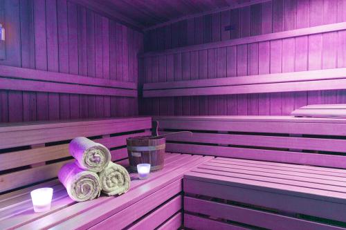
Colors can have a positive effect on our health and that of our children or influence our mood. This effect is used in a chromotherapy sauna where, in addition to the heat, the different colors you are exposed to play a role. The reason for this is an underlying belief that illnesses are caused by a lack of balance in life. Exposure to color can help restore this balance. Like in such a sauna, the body can also be influenced and stimulated by different colors in the environment. It is often the case that children are attracted to the colors that they need emotionally at the moment. It works in a similar way to eating, where the body knows best which nutrients it’s currently lacking – and we suddenly develop an appetite specifically for them. Unless this mechanism is out of balance.
When it comes to their food, children also enjoy “eating the rainbow.” A salad that contains many different vegetables not only stimulates the senses but is also fun to eat and will be devoured in no time. As such, it’s a good idea to add more variety here, too. In addition, the more colorful the salad, the more vitamins children consume.
Incidentally, there are a few people who can taste, hear, or smell colors. This phenomenon is called synesthesia. This is a condition in which different senses are linked together, causing some people to perceive colors when a different sense is stimulated, for example. Synesthesia isn’t a disease, on the contrary – this connection of the senses enriches the life of the affected person and makes it more varied. Neurophysiologist Marie-Luise Schreiter even explains that babies can’t completely separate their senses; this doesn’t happen until later. In other words, we’re all born as synesthetes.

Colors also help children express their moods and feelings when they paint or draw – similar to professional artists. The interesting thing is that adults assign individual colors to certain moods based on how they’ve learned to do so over the course of their lives. Marcel Zentner from the University of Geneva found that children do not assign colors to specific moods in this way – instead, they use different colors to express a certain feeling. For example, they painted faces that they wanted to portray as happy in the color red. They expressed sadness with blue, not black like the adults. Anger, in turn, was represented using completely different colors in the children’s pictures. What the children’s drawings all had in common, however, was that light colors tended to be associated with happiness, dark colors more with sadness.
The Healing Power of Colors
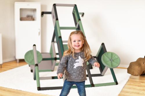
Alternative practitioner Dana Kümmeler describes colors as a gentle way of healing, which is even scientifically proven. Due to their different frequencies, colors have different effects – the color red creates a feeling of warmth, blue of cold. Shades that are located between red and yellow on the spectrum have a stimulating and warming effect on children, green is relaxing – it promotes healing. As the color of the sky and the night, blue cools, soothes the soul, and has a refreshing effect. With this in mind, it’s a good idea to use colors selectively or just leave it up to your kids to decide what colors they want to surround themselves with. The colors blue and green could help calm down restless children with a tendency to act aggressively. In contrast, red or orange can be used to energize calmer kids who may be a bit anxious.

Pastel shades also have a peaceful and harmonious effect. They are softer, more sophisticated, and often have an intellectual feel. This makes them perfect for stimulating a child’s intellect. In addition to safety and comfort, they radiate joy, optimism, and ease. And, in addition, can also be used with hyperactive children. But don’t forget to brighten up a child’s room dominated by pastels with other, bolder splashes of color.
The best thing to do is decorate different sections of a child’s room differently, provided the room is large enough. You could do this by creating a quiet corner for the baby in pastel shades, a sleeping area in shades of blue, and a corner to play and romp in bold, stimulating colors, for example – this will encourage little explorers.
Pink for Girls, Blue for Boys?
Yeah right! Girls don’t consciously choose to like pink. This is where cultural imprinting comes in. They’re taught on the Internet, on TV, and among their friends that pink or hot pink should be their color, and they often accept it as such. What’s even more interesting is that boys like pink too – at least until they learn that it isn’t cool. So it’s high time to finally dispel this cliché! That’s why you should watch your children, let them make suggestions, and in this way, support their free will (as long as we’re talking about harmless decisions). This is far better than blindly following the widespread consumer trend.
The QUADRO Colors
CLASSIC
Fortunately, QUADRO is extremely versatile and offers a range of colors for every mood and every need. We’ve selected the most popular colors to stimulate a child’s imagination – all of our CLASSIC sets contain the colors blue, green, yellow, and red in a colorful mix. In this way, children learn to distinguish between the colors during assembly – provided they are old enough – and to put them where they go as shown in the assembly instructions. Together with their parents, they can name the individual colors. The bold primary colors not only train the little ones’ color perception, but also their spatial awareness.
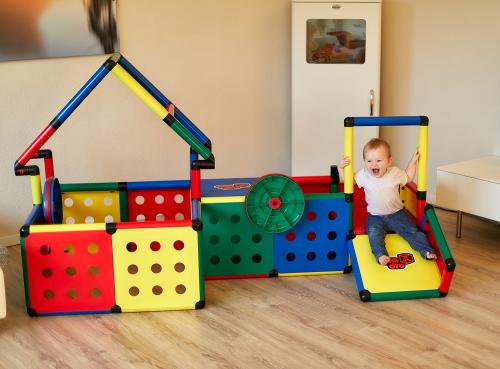
To ensure that your children will enjoy the colors for a long time, all QUADRO parts are dyed completely through. This means the jungle gyms aren’t only suitable for indoor, but also for outdoor use – they can withstand UV radiation perfectly, meaning they can be set up in your yard all year round. In addition, our jungle gyms and slides aren’t affected by chlorinated water, so you can put them in the pool. This means the possibilities are truly endless.
HOME
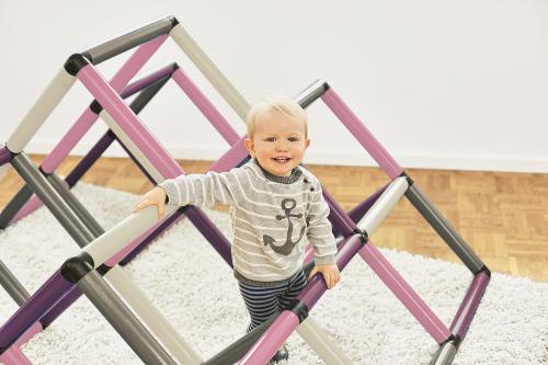
QUADRO’s new HOME series is the result of the knowledge we gained during our development work. It draws on a soothing and friendly color scheme and combines it with pleasant pastel shades: Petrol, Mint, and Berry. Sets in these colors are particularly suitable for quiet corners in a child’s room or the living room, which they blend into harmoniously and unobtrusively. The colors can be easily combined with many other soft shades – Petrol with other shades of blue, Mint with shades of green or apricot, Berry with soft pink or bright purple, but also with violet and light green. All of our HOME colors go extremely well with different shades of gray and look great with white accessories. We also recommend the HOME series especially for hyperactive children, as the subtle colors help them calm back down. But the HOME series is also a nice addition for all other children who already have toys in the typical bright colors.
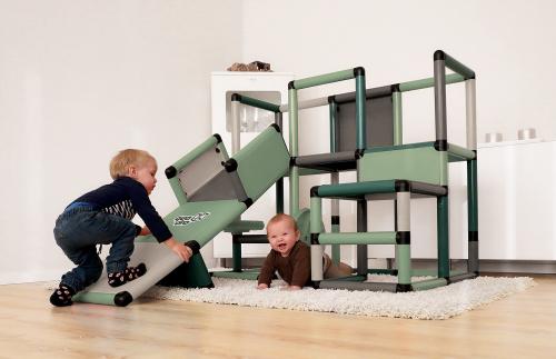
When it comes to color, QUADRO has something for every little explorer – the best thing to do is find the color that ideally suits them together with your children!
Sources:
- Tim Aschermann. Was ist RGB? Einfach und verständlich erklärt. 13.11.2015.
- Sascha Karberg. Alles so schön bunt hier – das Farbsehen. 14.09.2016.
- Abhängigkeit der Körperfarben vom Beleuchtungslicht. Lehrerinnenfortbildung Baden-Württemberg.
- Alina Soboth. „Schwarz ist keine Farbe“ – so entsteht die Farbe schwarz. 14.02.2019.
- Die Honigmacher. Ultraviolette Farbmale. 25.03.2011.
- Wörter und Farben. Zentrum für allgemeine Sprachwissenschaft, Typologie und Universalienforschung.
- Blau ist die beliebteste Farbe der Menschen. Welt Wissen. 22.08.2007.
- Farbpsychologie: 11 Farben, ihre Bedeutungen & 5 Tipps zur Anwendung. lernen.net (Die Quelle gilt auch für die übrigen Farben.)
- Farbenlehre. Zeichen lernen. (Die Quelle gilt auch für die übrigen Farben.)
- Impressionismus. ARTinWORDS.
- Josefine Pabst, Nina Berendonk und Nora Imlau. Starke Farben für kleine Leute. Eltern.
- Janina Widhammer-Zintl. Die schönsten Kinderzimmer-Farben und ihre Wirkung. InStyle. 14.12.2019.
- Do babies like color? If so, which ones? Science Blogs. 30.06.2009
- Michelle Roberts. Babies ‘have favourite colours’. BBC News. 08.05.2005.
- Ashley Jones. Your Toddler’s Favorite Color Can Mean More To Them Than You Think, According to Science. 06.03.2019.
- Walter Willems. Deshalb können manche Menschen Farben hören. Welt Gesundheit. 06.03.2018.
- Johanna Kelch. Synästhesie: Farben hören, Töne schmecken. mdr Wissen. 20.01.2020.
- Color preference in kids and adults. Science Blogs. 13.06.2005.
- Dana Kümmeler. Farben Bedeutung, Wirkung und Farbtherapie: So hilft sie Ihrem Kind. Elternwissen.com
- Janina Widhammer-Zintl. Die schönsten Kinderzimmer-Farben und ihre Wirkung. InStyle. 14.12.2019.
- The Psychology of Color: How to Choose Colors for Your Home. Custom Home Group. 09.10.2013.
- Grace Fussell. How Subtle Pastel Colors Can Make a Big Impact in Your Designs. 23.10.2019.
- Lucinda Rosenfeld. Red! No, Blue! No, Light Blue! Why do little kids care so much about favorite colors? 18.04.2012.
Komentarji